Sep 30 2012
What you don’t see is sometimes more than what you get…
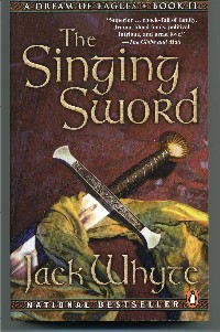
I found the attached photographs recently while tidying up some old artwork files, and it occurred to me that some of you might be interested in seeing them, purely for the sake of curiosity. They date from about 2009, around the time when the Marketing folks at Penguin Canada first realized that my domestic Canadian sales were approaching the 1,000,000 mark and the decision was mad

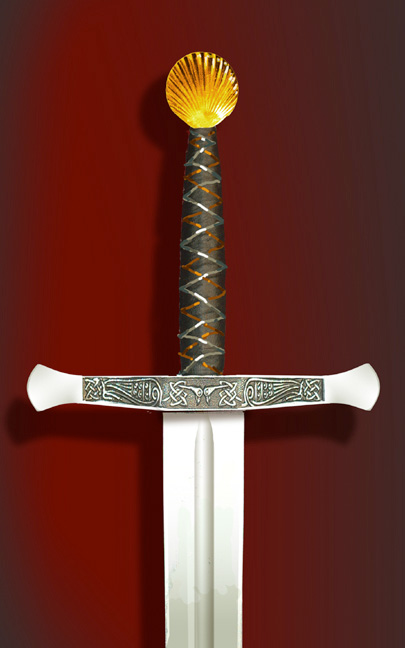
e to celebrate the million sales by re-issuing and rebranding the original series, “A Dream of Eagles” with new cover artwork for the mass-market editions.That kicked off a quest to find an appropriate, thematic motif for the series, and I came up with the idea of incorporating a single, significant element element from each of the stories as the cover illustration for that particular book. In this particular instance, for “The Singiing Sword”, the obvious choice was the sword Excalibur itself , and the Art Department at penguin canada came up with a whole series of possible treatments, none of which fit the bill until I realized what it was that was missing… And so we concentrated on depicting the sword exactly as I had visualized it and described it in the book itself: the gold cockleshell pommel, the gold- and silver-wired, sharkskin hilt and the straight cross-guard inscribed with Celtic scrollwork.
 The end result was perfect–a virtually photographic depiction of the sword I had envisioned for so many years… I still choke up when I look at it, and it seems to be I could reach out and pick it up, knowing exactly how it would feel and behave in my grip. And so here’s the original artwork, and the finished cover.
October 2, 2012 @ 6:47 pm
It is amazing that something so lethal is at the same time so beautiful. I've never handled a sword, and have only seen correographed fighting in plays and movies. I can imagine that having a well balanced weapon would be a huge benifit. The fact that they made them beautiful too, even the rudimentary ones have a beauty to them. This one is certainly a work of art , I would love to see it in actuality!
October 6, 2012 @ 5:47 am
the physical appearance of the minds creation can be an amazing thing. I can only imagine what you must have felt like seeing it with your eyes instead of your mind for the first time. Great post!